Sunset Canon Setlement

© Beth Spencer

Sunset Canon Setlement

Uploaded: October 22, 2013 18:16:49

Description

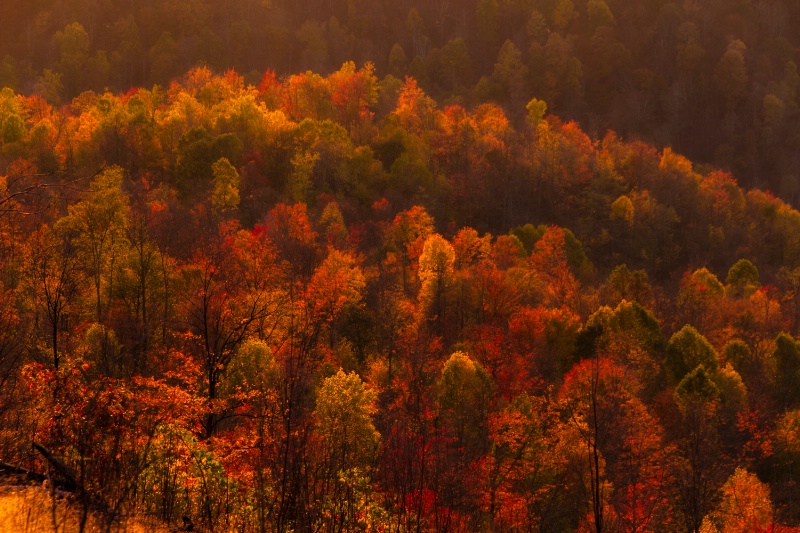
Ca, ISO non 7D, Tamron 18-250 mm lens, 1/30, f/9, ISO 200

Exif: F Number: 9, Exposure Bias Value: 0.00, ExposureTime: 1/30 seconds, Flash: did not fire, compulsory flash mode, ISO: 200, White balance: Auto white balance, FocalLength: 119.00 mm, Model: Canon EOS 7D

Comments

Beth Spencer October 22, 2013

I missed the virtual photo walk this Saturday, because I was working, but these were taken on Friday. I guess that is close enough. We have rain since then and most of the leaves are now gone.
Here are a couple more from the other side of the mountain #1549618

Jeff E Jensen October 22, 2013

That first one should be printed and hung on the wall. #10878896

Susan Williams October 22, 2013

Beautiful captures, Beth. I love the layers of colors and light. #10878903

Dale Hardin October 23, 2013

A beautiful spot that I've yet to see. Maybe next year. "Pretty in red" is my favorite of the bunch. #10879153

Elaine Hessler October 23, 2013

Wow those are gorgeous! So vibrant! #10879460

Michael Kelly level-classic October 23, 2013

Comming in at this point I hesitate to make suggestions as the otheres seem to like these as shown. However in the Phello's spirt I have to say that they look like they are very dark and almost as if they were shot through a red filter. I think a cooling of the WB and a bit of lightening would improve them a lot. If you do that you may need to make some levels or shadow highlight adjustment too. I think I have mentioned this before but have you calibrated your monitor. So many of your shots look very dark to me that it may be that your monitor is set to bright so they look OK to you. I do like them and it looks like you have some great fall colors to shoot. #10879494

Stephen Shoff October 23, 2013

I agree with Mike, the rich colors are great but the overall impression is a dark picture. What appears to be lens flare in the upper third of the picture is technically a problem but in this case serves to add some "atmospherics" to the composition. I think though, if you could reduce that just along that upper ridge it would help enhance the 3-dimensionality of this image by moving the back, darker trees further away. #10879723

Susan Williams October 24, 2013

My impression is that these images were taken at twilight and the available light set the mood. And not only was it the end of the day, it was also the end of Beth's Fall Colors. Since she used "sunset" in the title, it seems that is what Beth wanted to convey. #10879926

Susan Williams October 24, 2013

My impression is that these images were taken at twilight and the available light set the mood. And not only was it the end of the day, it was also the end of Beth's Fall Colors. Since she used "sunset" in the title, it seems that is what Beth wanted to convey. #10879927

Rita K. Connell level-classic October 24, 2013

these are beautiful Beth, but I am on the side of the mike and Stephen even from my laptop they look to dark. I think if you do mike suggestions these great shots will really jump out at you. Can't wait to see them.

our timing here in the smokies is still a little early the reds have popped yet to much. #10880283

Beth Spencer October 25, 2013

I started over with this one, I used the glamor glow filter on the original and I think that is where most of the red glow came from. I left it off on this one and did minimal editing.
The sun was setting on the other side and the light was hitting the front of the trees and I was shooting from above the hillside.
Mike I have not calibrated this monitor, not sure how too, and am afraid, so do you have some direction there?
Stephen, I am not sure where you were seeing the flare and am wondering if it was just where the light was hitting the top of the hillside.
I am open for help here. Oh by the way we have 4 inches of snow from the flurries for the last 2 days sitting on everything. #10880623

Beth Spencer October 25, 2013

One more, Took the first post and adjusted the levels and hue and saturation, #10880633

Michael Kelly level-classic October 25, 2013

I like the last post a lot. You did a great job with the adjustment. Everything is still rich looking but the red haze is gone and I can see a lot more detail.

There are so many ways that monitors adjust that it is almost impossible to give general directions. I use a Spider Pro to adjust mine which automatically creates a custom profile for my monitor, but that is because I print my own shots and need to have that level of quality. My concern with your calibration is simply because your shots consistently appear dark when I view them compared to my own or other posts. It may be you just prefer them like that or that your monitor is set on the bright side and you can’t see they are dark. Here is a link to a calibration photo. Looking at this photo on your monitor the most important thing is that you see a shade difference between a and b and y and z. If for example if x, y, and z all look like white your monitor is set to bright and if a, b, and c all look black your monitor is set to dark. You may not get both ends to look perfect depending on your monitor. To adjust simply play with your brightness setting. http://www.photofriday.com/calibrate.php This will not give you color calibration but I don’t see any issue there with your shots.
#10880830

Elaine Hessler October 25, 2013

Wow-that is so vivid. I admit, I do like it lighter too. Very nice job. Are you going to print this out?

That calibrator is pretty cool-I checked it out and I can see the differences. I keep thinking of buying a Huey, but when I print at the local photography shop, it is pretty close to what I am seeing on my monitor, so I guess it is okay for me. The monitor is 3 years old, so I am sure it is a bit off, though... #10880997

Beth Spencer October 25, 2013

Thanks Mike, this is really cool. I think it is set too bright will work on that probably Sunday. My xyz all look the same I can see the rest of the differences. I also think I tend to make them a bit too dark... I need to start paying attention to that.
Thanks Elaine, I think I probably will print this one, I do like it.. #10881102

Stephen Shoff October 26, 2013

Since you are describing front-lit lighting with the sun behind you, the appearance of flare I referred to is more likely atmospheric haze, and yes, the haze is stronger on the far ridge at the top of the picture. Reducing the reds did reduce the haze.

For colors and tonality, I think I prefer your levels and hue adjustments applied to the original post. It reduces the haze effect on the foreground better and retains more of the rich reds. (Reducing flare/fog/haze is a [sometimes unwanted] side effect of setting the black and white points using levels.) However, I still think that if you applied a mask to your levels layer over the far ridge in order to bring the haze back, you would increase the sense of depth in the picture.

Compositionally, your Edit 4 may be the strongest. It is hard to find an anchor point for the eye to rest on in the darker versions. In Edit 4, since it is so much brighter, the black tree at the lower left ROT stands out just enough to provide that anchor. In contrast, the mass of red at the lower right ROT is where my eye is drawn to in your original post.

So IMO, to merge the best of all worlds...I see 3 zones in this image: the foreground (half the image up to the first set of bright treetops), the mid-ground (the narrow band of dark topped with a 2nd set of bright treetop) and the background of low contrast and tonality green at the top. It is the diagonal line and glow of tree tops in the mid-ground that I like most in this image.

You might see if you can lighten or de-saturate just the foreground a bit to strengthen the tree trunk at the lower left ROT and to increase separation between the foreground and the mid-ground. Then also get a little more "haze" back in the background layer.

Just a post-processing note...I generally do all my cloning and generalized tonal adjustments like WB, levels, contrast before I apply filters. For me, filters are not an "instead of" but an "in addition to" my normal workflow.

Great Fall image, Beth. I think there are several really good "versions" that could be pulled out of this capture. #10881408

Debbie E. Payne October 28, 2013

Beth, I just MUST see this part of the country one of these falls! We don't see much of the reds in any abundance here in Colorado. I also am leaning towards Edit 4 as it communicates a much more specific subject. I will leave the dissertations (which I love to read, whether for myself or anyone in the group) to Stephen and Michael.

I think my monitor is pretty close to what I have printed at Mpix, but it is probably time to recalibrate. A job for both me and Martin. #10883510

Beth Spencer October 31, 2013

Thanks everyone, I am sorry it took so long to get back to this, but I tried Stephen"s suggestions and think I do like this too...
Debbie anytime you want come on over! Our leaves will probably all be gone by tomorrow, there is a high wind warning for tonight and not many left as it is. #10885270

JO ANN CLEVELAND December 03, 2013

Gorgeous, especially the one Stephen suggested, great finalist!

jo ann c. #10914043

Dale Hardin December 03, 2013

Congratulations Beth. #10914061

Beth Spencer December 03, 2013

Thank you JO Ann and Dale. #10914205

Merna L. Nobile December 13, 2013

Award winning photographers are not great just because of their technique; they are great because of their passion.
Congratulations for your achievement, November, 2013.
#10920955

Beth Spencer December 13, 2013

Thank you Merna #10920996

To discuss, first log in or sign up (buttons are at top center of page).

Get Constructive Critiques

Sign up for an interactive online photography course to get critiques on your photos.


Did You Know?

Discussions by Category: You can view photo discussions on various themes in the Community > Photo Discussions section of the site.

BetterPhoto Websites: If you see an orange website link directly under the photographer's name, it's totally okay. It's not spam. The reason: BetterPhoto is the one that offers these personal photography websites. We are supporting our clients with those links.

Unavailable EXIF: If there is no other information but 'Unavailable' in the EXIF (meaning no EXIF data exists with the photo), the 'Unavailable' blurb is not displayed. If there is any info, it shows. Many photos have the EXIF stripped out when people modify the image and resave it, before uploading.


The following truth is one of the core philosophies of BetterPhoto:

I hear, I forget.
I see, I remember.
I do, I understand.

You learn by doing. Take your next online photography class.

BetterPhoto.com Photo Contest Finalist


Copyright for this photo belongs solely to Beth Spencer.
Images may not be copied, downloaded, or used in any way without the expressed, written permission of the photographer.
Log in to follow or message this photographer or report this photo.