
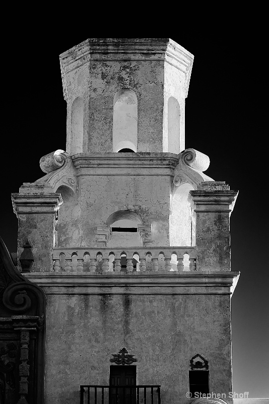
Mission San Xavier del Bac (B&W)
Uploaded: July 07, 2012
f/8, 1/60 sec, ISO 200; ; EF 24-70mm f/2.8L @ 70mm
Exif: F Number: 8, Exposure Bias Value: 0.00, ExposureTime: 1/60 seconds, Flash: did not fire, compulsory flash mode, ISO: 200, White balance: Manual white balance, FocalLength: 70.00 mm, Model: Canon EOS 5D Mark II
Susan M. Reynolds
 July 07, 2012
Susan M. Reynolds
July 07, 2012
Michael Kelly
 July 07, 2012
Susan because I have been off I did not realize that you are just back. A big welcome back from me too. #10218451
Rita K. Connell
July 08, 2012
but boy do I like your last post, pov is much more interesting the lighting is better for the black and white. great job! #10219899
Michael Kelly
July 08, 2012
Sign up for an interactive online photography course to get critiques on your photos.
Discussions by Category: You can view photo discussions on various themes in the Community > Photo Discussions section of the site.
BetterPhoto Websites: If you see an orange website link directly under the photographer's name, it's totally okay. It's not spam. The reason: BetterPhoto is the one that offers these personal photography websites. We are supporting our clients with those links.
Unavailable EXIF: If there is no other information but 'Unavailable' in the EXIF (meaning no EXIF data exists with the photo), the 'Unavailable' blurb is not displayed. If there is any info, it shows. Many photos have the EXIF stripped out when people modify the image and resave it, before uploading.
The following truth is one of the core philosophies of BetterPhoto:
I hear, I forget.
I see, I remember.
I do, I understand.
You learn by doing. Take your next online photography class.
Copyright for this photo belongs solely to Stephen Shoff.
Images may not be copied, downloaded, or used in any way without the expressed, written permission of the photographer.
Log in to follow or message this photographer or report this photo.