|
Steven Couto |
Salvaging A Photo - Need Some Critique
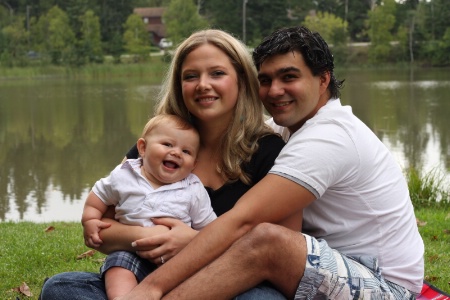
The compositions a mess Ok now that that's out of the way. I'm trying to salvage this photo as best as I can. Though I'm now starting to wonder if it's worth the work in trying. - I corrected the white balance from daylight (what it was taken at) to cloudy (which it was). - Added fill light to brighten things up - took out any distracting elements (blanket and half the car) - and eliminated most of the road running through their heads But still it looks...bad. Maybe it's just me. But go ahead and be brutally honest. It won't break my will to get better...much.
|
|||||||||||||
|
|
||||||||||||||
|
Douglas M. Pruden |
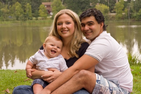
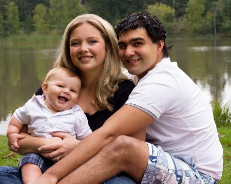
I would consider some aggressive cropping of the image. Try cropping down to the 3 people in the image and arrange them according to the rule of thirds around the eyes of the dad. Only after the crop would I play around with the exposure etc as now the distracting elements have been removed and you can focus on the family, which is the subject. Just my $0.02 worth.
|
|||||||||||||
|
|
||||||||||||||
- Reynaldo D. Reyes Contact Reynaldo D. Reyes Reynaldo D. Reyes's Gallery |
You did a fairly decent edit on the image. I agree with you that there is a need to make some changes and put the emphasis on the subjects, since the background is competing heavily with the group picture. First things first, I would straighten the horizon as I think it is a little tilted. Next, I'll try to select the 3 people with the lasso tool and do an inverse selection. Then use the Gaussian blur to blur the background. BTW, add a duplicate layer before doing this so you can comntrol the amount of blurring if you do not like the effect. Just use an appropriate feathering to blend the blurring properly. This should improve the picture somewhat although next time use a wider lens aperture to blur the background naturally. Experiment some more and I hope this helps.
|
|||||||||||||
|
|
||||||||||||||
|
Anthony L. Mancuso |
Great expressions here Steven so I think this is definitely worth saving. I agree you should crop tighter to remove alot of the bacground distractions. I would try a horizontal 8X10. When you crop, consder bringing the bottom edge above the Dad's wrist but keep it below his knee, cropping through a joint tends to look awkward. I would take a small portion of the space above their heads off as well. Place the left and right sides to place the subjects heads in the approximate ROT spots...
|
|||||||||||||
|
|
||||||||||||||
- Irene Colling Contact Irene Colling Irene Colling's Gallery |
You're too critical of yourself. The family itself looks good. They all have nice expressions and are positioned well. The background is nice and lends an element of interest to the portrait but it also competes with the subjects for attention. The process you went through to lighten shadows was correct to bring out detail but you lightened the background also so there is still competition for attention. If this were my photo I would lighten the people and foreground only, but NOT the background. This step will immediately make the people pop and by leaving the background darker the eye will naturally refocus back on the people. I don't know what your editing skill are but if this were my photo this is what I'd do. 1. straighten horizon. 2. crop as Doug suggests above. 3. at the very least I'd clone out the white car behind Mom's head but most likely I'd go even further and remove the building and car entirely. (copy and paste a tree section from else where in the picture, then use a layer mask to blend the section.) 4. duplicate the image and use levels to lighten shadows as you did. 5. use a layer mask to paint back the darker background. 6. Blur the background layer slightly more. 7. Sharpen key elements of the foreground layer (eyes, hair etc.)
|
|||||||||||||
|
|
||||||||||||||
|
Steven Couto |
|
|||||||||||||
|
|
||||||||||||||
|
This old forum is now archived. Use improved Forum here
Report this Thread |
||||||||||||||