To discuss a photo, sign up as a BetterPhoto member or log in.
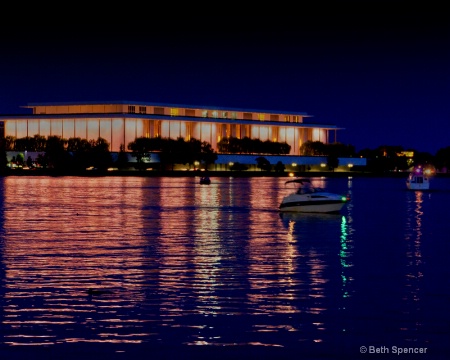
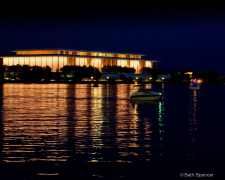
Phinal Edit Georgetown
|
|||||||||||
|
|
|||||||||||
|
Beth Spencer |
I started over with this one and then applied a gradient, with the help of Dale's tutorial... Thanks Dale.
|
||||||||||
|
|
|||||||||||
- Michael Kelly Contact Michael Kelly Michael Kelly's Gallery |
Beth I just need to be blunt here. This edit is a step backward from the original posts as I remember them. This is dark and muddy and the lighting in the windows has a gray cast that does not look good or natural as that is the light source for the shot. I would toss this and go back to your prior original or one of the edits that you liked in that thread.
|
||||||||||
|
|
|||||||||||
|
Stephen Shoff |
Yeah, I don't care too much for the over saturation and blocked up colors either. I have a hard time with these images with bright, high contrast colors. there just isn't much latitude in the adjustments you can make.
|
||||||||||
|
|
|||||||||||
|
Jeff E Jensen |
Yup, I agree with the guys, the previous version was better.
|
||||||||||
|
|
|||||||||||
|
Dale Hardin |
It's unanimous Beth. The other version was better. You may have misunderstood the tutorial because I was suggesting you only use the gradient on the sky, not the entire image.
|
||||||||||
|
|
|||||||||||
|
Aimee C. Eisaman |
Me too...not sure what happened, but I recall the other versions looking better. This has a muddy unnatural appearance to it. Sorry! I had really liked one of your last versions.
|
||||||||||
|
|
|||||||||||
|
Beth Spencer |
|
||||||||||
|
|
|||||||||||
| Log in or sign up to respond or interact. | |||||||||||