To discuss a photo, sign up as a BetterPhoto member or log in.
Conway Summit North
|
|||||||||||
|
|
|||||||||||
|
Stephen Shoff |
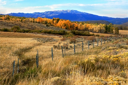
Conway Summit on U.S. Hwy 395 just above Mono Lake, CA. Brandi -- just to avoid confusion...I'm bending the rules a little here. My other picture was uploaded more for the fun of the picture than for serious critique. This one is uploaded for critique.
|
||||||||||
|
|
|||||||||||
|
Kristin Duff |
nice lead into the photo by way of the fence...and the colour of those trees! Are they larches?
|
||||||||||
|
|
|||||||||||
|
Aimee C. Eisaman |
I too like the fence leading into this image. I also like how little of the sky is in this shot. So many layers of textures makes this very interesting. I wonder are the mountains really that purple looking? Overall the image seems a bit saturated for your usual style...was there a reason for that here? :~)
|
||||||||||
|
|
|||||||||||
simplydivinephotography.com - Susan M. Reynolds Contact Susan M. Reynolds Susan M. Reynolds's Gallery |
Hi Stephen, I like the contrast of colors and leading line of the fence, but Aimee beat me to asking about that being the true color of the mountains. On my screen the like like a very bright Royal blue!
|
||||||||||
|
|
|||||||||||
|
Jeff E Jensen |
Very nice, Stephen! I like that the fence leads you across the image and then the row of trees grabs you and takes you right back in.
|
||||||||||
|
|
|||||||||||
|
Kristin Duff |
Living in the foothills of the Canadian rockies, I think your mountains look just fine...depending on how the light is falling mountains can look very pale blue all the way to a screaming purple!
|
||||||||||
|
|
|||||||||||
|
Dale Hardin |
Stephen, I'm trying to place the location of this shot since I've traveled the 395 many times, but am not familiar with summet names. I'm assuming this is the pass North of Bishop, which is way north of Mono Lake.
|
||||||||||
|
|
|||||||||||
|
Stephen Shoff |
Dale -- since Bishop is 30 miles south of Mono Lake, and this was taken about 3 miles north of Mono Lake, this is way north of Bishop, but not way north of Mono Lake. It's also about 15 miles south of Bridgeport and the Bodie turnoff. The unfamiliar aspect of this image is that it was taken facing north towards Bridgeport rather than west towards the crest of the Sierra. That Aspen grove is the same grove that Mike and I published photos of a couple of years ago, just from a different direction. Aimee, et. al., I'll review the colors when I get home this evening. They look fine and pretty much as I intended on my "standard" monitors at work and cell phone screen, so I expect that they should look as I intended on your monitors. However, I work in a wide gamut, highly color managed environment at home so it can be difficult for me to know what everyone else is seeing. While the colors aren't "wrong", I was trying to bring out richer blues in the sky and texture in the far mountains, and get some "glow" in the oranges and yellows. But if you are seeing really harsh oranges along with un-natural blues, please let me know. Krstin, this was taken at 5:30 in the evening looking perpendicular to the sun. The sun was just setting behind the crest of the Sierra on the left. The mountains are 20-30 miles distant. there is a wide valley between those closer foothills just beind the trees and the far mountains.
|
||||||||||
|
|
|||||||||||
|
Debbie E. Payne |
Stephen, I am seeing this a bit more saturated than you usually post, but I also know that sometimes this amount of color is nearly what we see on just such a day in the West.The only color that bothers me is the sky with a bit too much cyan. Otherwise, I love the leading lines and the textures as already noted. Makes me want to be there, for sure. One of these days when we are RV'ers, we must get to yours and Mike's neck of the woods.
|
||||||||||
|
|
|||||||||||
|
Aimee C. Eisaman |
I wasn't saying that it is over the top or harsh....was just noticing the same as Debbie that it seems more vibrant in colors than most of your other landscapes. I actually really like it! :~)
|
||||||||||
|
|
|||||||||||
- Michael Kelly Contact Michael Kelly Michael Kelly's Gallery |
Stephen I like the comp on this a lot and the colors in all the FG look good. The sky color and the mtns definitly look funny to me as far as color and WB and perhaps even saturation. Were you using a color filter over the lens or something like that? I am really not sure what is going on here. If there is a general WB problem I don't see it in the FG.
|
||||||||||
|
|
|||||||||||
|
Stephen Shoff |
Thank you for your additional comments Debbie/Aimee. That was valuable to me. I'm more confident we are seeing the same thing now. This is more saturated than I usually post...by intent. In the original image, the sky is very washed out and the far mountains were far enough away that it was hard to see the nice light on them, so I used a couple of multiply layers to pull out all that detail. I haven't found a way to improve the sky color so I'm going to leave it alone.
|
||||||||||
|
|
|||||||||||
|
Stephen Shoff |
No Mike, no color filters. But there is a hue/saturation layer to bring out color and detail in the sky, and detail in the lower mountains.
|
||||||||||
|
|
|||||||||||
- Rita K. Connell Contact Rita K. Connell Rita K. Connell's Gallery |
I have to agree with everyone else...this is a wonderful capture of the fall the leading fence line is very nice taking you right into the image. but the color of the sky and mt is throwing the whole image off. maybe on your last layer you can do a color channel adjustment on the sky and mt.
|
||||||||||
|
|
|||||||||||
|
Stephen Shoff |
Sorry, I've tried a number of adjustments, including a channels layer (which I don't know how to use and have never gotten a satisfactory result from). I can't get a more pleasing blue than the one presented. As presented, it is very close to the same color as in both the JPG and RAW out-of-the-camera images.
|
||||||||||
|
|
|||||||||||
|
lisa anderson |
I love the fall colours here (the photo looks a little too sharp on my screen). The fence, the windy path, the grass, the line of the trees...I really like this photo
|
||||||||||
|
|
|||||||||||
|
Brandi K. Mills |
This is gorgeous! I also like how the eyes follow the fence line to the right, then the line of trees to the left and up to the mountain.
|
||||||||||
|
|
|||||||||||
| Log in or sign up to respond or interact. | |||||||||||