To discuss a photo, sign up as a BetterPhoto member or log in.
Ironweed
|
|||||||||||
|
|
|||||||||||
|
Beth Spencer |
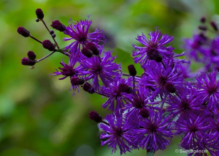
This is West Virginia Iron Weed! I took this the other morning on the walk with the dogs. I need some help! The plant is a really dark deep purple, however in all the raw shots, it almost looked pink. I had to decrease the reds to get the correct color, but I am wondering if it was the light or what would cause the color to be off. The sun was coming up and I believe most the light was in the front.
|
||||||||||
|
|
|||||||||||
|
Teresa H. Hunt |
I'm not sure . . . could it be a WB issue? The deep purple you have here is beautiful :)
|
||||||||||
|
|
|||||||||||
|
Stephen Shoff |
I took a quick look on the Internet to see what variances of color there seem to be for Ironwood. The link slows one set of pictures with a fairly wide range of colors. None of them are "wrong", but they may not be the color you saw, remember, or want to emulate. http://flickrhivemind.net/Tags/ironweed/Timeline So I think you have the right idea -- the color of a flower often varies by the quality and angle of light hitting it. It might show a lot more magenta (i.e purple tending towards pink) tones in warm morning light, backlight, or even bright direct light causing a lot of reflection off the petals. Over-exposure might also shift the colors towards pink. This image looks like backlight (i.e., the sun in front of you as you described and hitting the flowers from behind ). Also, the white-balance interpretation in your editing program (or camera) can affect image color as Teresa suggested. For example, in the Water Lily image I posted from the DC trip, the flower has really delicate lavender coloring in the petals. In the light as I saw it, there was very little color. Setting black/white points in Photoshop brought out the pigmentation in the petals. I could blow out that color by brightening the image. (Note: "pink" is a desaturated purple) Setting the black/white points individually for each color channel in Levels often corrects color without having to guess at it by using color sliders in Hue/Saturation or Selective Color controls.
|
||||||||||
|
|
|||||||||||
|
Peter W. Marks |
Beth, like Stephen, I went into the internet and on Google images turned up a couple of hundred ironweed images. Almost without exception they showed deep pink/mauve flowers and none with the intensity of purple that your very beautiful image have. But here's the thing- you are the artist so you choose the hue and intensity and having looked at the two hundred it is your's that has a real impact. I am sure Stephen's technical stuff will be well worth playing with and I would certainly be interested in what you could come up with. Now, not a lot of folk know this fascinating fact and probably few would want to know it, but it is thought that some native American peoples used some species of Ironweed to treat stomach problems and may even have used the root to treat post childbirth pain and to restore regular menses. Now there's some things we never knew just a few hours ago when we arose to greet the day!
|
||||||||||
|
|
|||||||||||
|
Beth Spencer |
Thank you Stephen, Teresa and Peter. I was out again today and looked really close at these and indeed they do have a magenta/pink color to them up close but from further away they look really dark purple. Stephen could you give me some directions on setting the white and black point? Peter thank you so much for taking the time to research this and share the information you found!
|
||||||||||
|
|
|||||||||||
- Michael Kelly Contact Michael Kelly Michael Kelly's Gallery |
Beth generally color changes are due to white balance problems. While I will very ocassionaly set B&W points and even go through a bunch of arcane things to set a mid point level in 99 times out of 100 you can just adjust the temperature and tone slider in ACR and bring things in very close and very quick. I set my exposure first though by looking at the histogram and centering it. Further adjustments I make in Levels after opening in PS. Everyone has their own workflow though so develop one for yourself and stick with it. With that process in hand editing can be fast and accurate.
|
||||||||||
|
|
|||||||||||
|
Jeff E Jensen |
Thanks Peter, that should come in handy some day. . . . .
|
||||||||||
|
|
|||||||||||
|
Stephen Shoff |
Beth, the Levels adjustment that Michael referred to, and that you are probably familiar with, is the same thing. The intent of setting the black points (left end of the Levels slider) is not primarily color adjustment -- it is setting the darkest point in your image, which may not be truly black (i.e., the RGB [0,0,0] coordinates) to true black so that you get better color contrast. You notice the effect more when there is slight haze in your image (over exposure, lens flare, atmospheric haze). It generally drops that haze right out and colors become richer because of the contrast with true black. The white point (right end of the Levels sliders) is optional depending your your artistic intent (e.g., you don't set a white point in picture with fog or you lose the fog itself). Conversely, in a high-key image you may not want to set the black point. When you set each of the 3 color channels individually in Levels, rather than use the default RGB setting in the drop-down, you can also get better color if you haven't already set the white balance in ACR. Most often, in accordance with Mike's description, if I've managed to set the white balance (emphasis on "balance") in ACR properly, setting the black or white points in Photoshop or PSE don't change anything. As I understand it, using the Blacks slider is ACR's method for setting the black point. Again, setting the black point is not intended to be color correction, but it can be if done at the 3 color channel level and you haven't already set white balance using a different tool. I'm just reaching the point in my processing that I have confidence that setting white balance in ACR (using the eye-dropper) along with setting the Blacks is truly redundant with setting the black point in CS4 and can start eliminating that task from my CS4 processing.
|
||||||||||
|
|
|||||||||||
- Rita K. Connell Contact Rita K. Connell Rita K. Connell's Gallery |
Beth you got some great advise, this if very nicely capture with the b/g green and blurred, a nice contrast. but for me the flower need to have the shadows open up a little. it appears a little dark.
|
||||||||||
|
|
|||||||||||
|
Beth Spencer |
|
||||||||||
|
|
|||||||||||
|
- Rita K. Connell Contact Rita K. Connell Rita K. Connell's Gallery |
thanks Beth, I actually like the first edit best out of the three. It looks the most natural to me. the greens are to blue in the other two, kinda like dale lions.
|
||||||||||
|
|
|||||||||||
|
lisa anderson |
I like edit #2 the best...i do wonder what medicinal uses for ironweed Jeff thinks will come in handy :)
|
||||||||||
|
|
|||||||||||
|
- Michael Kelly Contact Michael Kelly Michael Kelly's Gallery |
I am going with 2 also as the best to my eye. It takes time Beth so don't get discouraged - very powerful programs with long learning curves on top of photography in general which is a lifelong learning process.
|
||||||||||
|
|
|||||||||||
| Log in or sign up to respond or interact. | |||||||||||