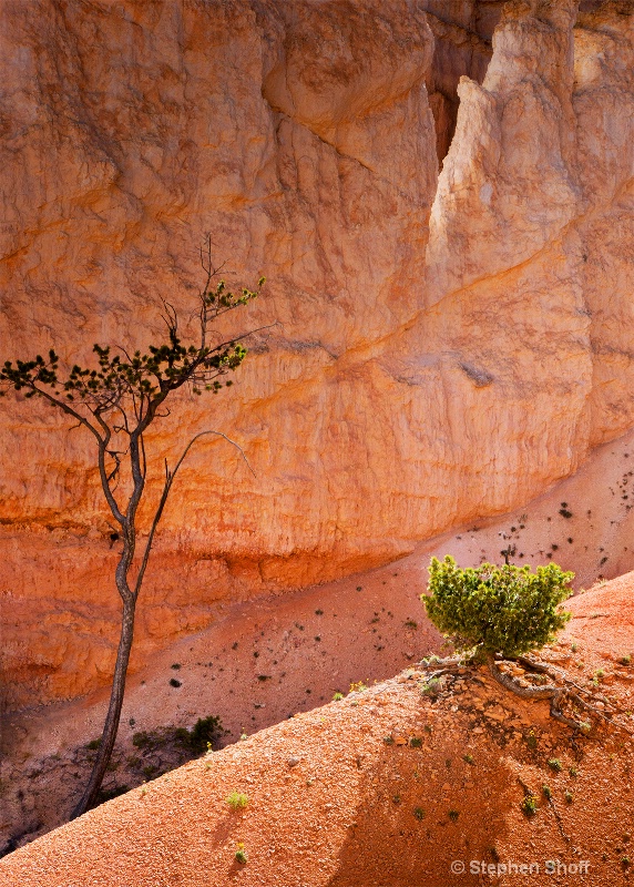
Canyon Glow

© Stephen Shoff

Canyon Glow

Uploaded: June 20, 2013

Description

f/16, 1/80, ISO 400; Tamron 18-200 OIS @ 60mm

Tower Bridge Trail, Bryce Canyon Nat'l Park

Exif: F Number: 16, Exposure Bias Value: 0.00, ExposureTime: 1/80 seconds, Flash: did not fire, compulsory flash mode, ISO: 400, White balance: Manual white balance, FocalLength: 39.90 mm, Model: NEX-7

Comments

Rita K. Connell level-classic June 21, 2013

Stephen I really like this one, I really like the placement of the two trees and the simplicity of it. the contrast is very nice between the two. I can see this hanging on the wall. the only problem I see is...if you would frame it the tree on the left will get eaten up some with the mat and frame so if you can I would give it a little more room if you cropped this. great shot! #1533235

Jeff E Jensen June 21, 2013

I agree with Rita's suggestion on the left edge. Otherwise, this is pretty fantastic. That light is absolutely amazing. #10740729

Michael Kelly level-deluxe June 21, 2013

Great light and color! This is the south west color palette in its most wonderful form. I would be proud to hang this on my wall, and I think the simplicity and color make this a good candidate for sale.

I do agree that if you have any more, a bit more room on the left would be good. Also, it looks just a bit over sharpened to me. It may just be the light, but if you did any sharpening I would back the settings off just a touch.
#10740827

Elaine Hessler June 21, 2013

I agree with the above. I love the how the little bush is anchored in the corner with its roots and shadows. And the reflection of the sunlight on that rock brings out the details beautifully. I love the how the light plays on that "V" in the rock in the upper right hand corner.

Beautiful shot! #10740903

Susan Williams June 22, 2013

Very creative composition and use of light, Stephen. I agree with the others on a little more on the left if you have it, or can create it. If you don't do that, I would crop just a little off the bottom to put the diagonal in the corner and adjust the foreground to enhance the shadow. I love how the light touches the top leaves in the tree. Outstanding work! #10741760

Teresa H. Hunt June 22, 2013

Great image Stephen! I love the simplicity and the light. I agree with the others on the need for a little more room on the left. Otherwise it's perfect :) #10741862

Beth Spencer June 24, 2013

Amazing light!! I also love the simplicity of it. I bet we see this one again! #10744155

Debbie E. Payne June 24, 2013

Stephen-- you cannot lose with the red rocks. Lighting in wonderful and there is a nice tension between the two trees. I agree with making more space on the left, but just a tad! #10744242

Stephen Shoff June 24, 2013

There isn't any more space on the left in the original. I do have a recurring problem of framing things too tightly and not allowing for framing, often because I am trying to exclude extraneous, distracting content.

I don't particularly agree that the composition requires the extra space...the contours clearly indicate that there isn't significant amount of tree extending out of the frame, nor does the sparse foliage constitute a continuous line that leads the eye out of the frame. But I do agree with Rita's first comment that framing would lose that feel. I'll have to clone in some extra space to allow for framing.

Thank you, Elaine. That "V" was the entire reason for the composition and trying to capture the glow was my primary goal. I had seen that from half a mile away and was hoping it would still be there when I got close enough. I have found that photographing in the southwest is much more difficult than in the Sierra.

Over sharpened, possibly, for screen display, but it wouldn't print that sharp, I don't think. I'll check and see where I applied sharpening. In this image it may only have been in ACR Clarity.

Susan, I do pay attention to diagonals entering or leaving the frame at near corners. I also worry sometimes that that may come across as contrived. I think in this case that the shoulder with the small tree needs to exist as an element in a visual layer of its own and it requires the mass that would be lost if it exited lower. I also wanted the sparse clumps of grass in the shadow to appear complete. I think they do need the room in the frame that I'm not so sure the tree on the right requires. The larger bright green clump would look lonely and out of place without the repeating element below it. [Over thinking this again, Jeff]
#10744330


To discuss, first log in or sign up (buttons are at top center of page).

Get Constructive Critiques

Sign up for an interactive online photography course to get critiques on your photos.


Did You Know?

Discussions by Category: You can view photo discussions on various themes in the Community > Photo Discussions section of the site.

BetterPhoto Websites: If you see an orange website link directly under the photographer's name, it's totally okay. It's not spam. The reason: BetterPhoto is the one that offers these personal photography websites. We are supporting our clients with those links.

Unavailable EXIF: If there is no other information but 'Unavailable' in the EXIF (meaning no EXIF data exists with the photo), the 'Unavailable' blurb is not displayed. If there is any info, it shows. Many photos have the EXIF stripped out when people modify the image and resave it, before uploading.


The following truth is one of the core philosophies of BetterPhoto:

I hear, I forget.
I see, I remember.
I do, I understand.

You learn by doing. Take your next online photography class.


Copyright for this photo belongs solely to Stephen Shoff.
Images may not be copied, downloaded, or used in any way without the expressed, written permission of the photographer.
Log in to follow or message this photographer or report this photo.