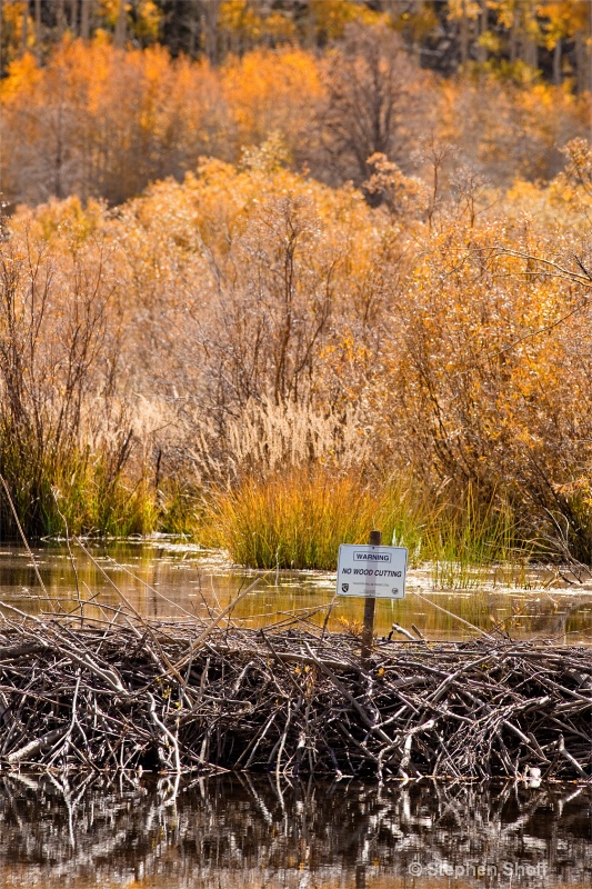
Zoning Violation

© Stephen Shoff

Zoning Violation

Uploaded: October 09, 2012

Description

Exif: F Number: 11, Exposure Bias Value: 0.00, ExposureTime: 1/320 seconds, Flash: did not fire, compulsory flash mode, ISO: 400, White balance: Manual white balance, FocalLength: 300.00 mm, Model: Canon EOS 5D Mark II

Comments

Dale Hardin October 09, 2012

This is really funny Stephen. Love it. But can't help suggesting a correction on the tilt. I wonder if that sign was meant for the beavers. Probably not since most of them can't read. :o) #1491333

Jeff E Jensen October 10, 2012

Yeah, very cool! I love your title, works really well. I agree with the old guy on the tilt, otherwise, looks good. Looks like you caught the tail end of the fall colors. They're really starting to drop around here. #10363603

Michael Kelly level-deluxe October 10, 2012

Saw a few of these signs but having one on top of a beaver dam was quite ironic.

Jeff the colors were all over the place from still green to very good to leaves being black spotted and down. Very different this year. #10363757

Aimee C. Eisaman October 10, 2012

Ha ha ha...a very funny picture! I like the colors and all the layers in this image. I can see that the sign really was leaning and am wondering if you correct that if the one tree in the background will look off. :~) #10363768

Elaine Hessler October 10, 2012

Very cute and I agree with the above. #10364401

Stephen Shoff October 10, 2012

I hadn't noticed the tilt. Thanks for the feedback. I'll correct that, but probably not repost it.

Glad you are enjoying this one. #10364421

Kristin Duff October 10, 2012

I love the irony of this photo! #10364630

Susan M. Reynolds level-addict October 11, 2012

Play of fall colors, irony of the sign....but I just knew Dale would mention the tilted sign.
I swear I think of both the verticle and horizontal tilts whenever I do photography Dale! I'm a sucker for fall colors and cold weather so I'm thankful it's finaly headed to Roseville, CA!
Pretty goldeny-orangish leaves on the trees - it contrasts well with the dead branches of the beaver dam! #10364734

Debbie E. Payne October 11, 2012

Stepen -- I like this image as well, for all the reasons noted. If the sign was meant for beavers, Dale, maybe they don't like straight horizons...Pete can research that to see if they make their dams straight or crooked.

Altogether, a fun image. I have a vertical image of a no trespassing sign that is kind of fun and another from Kauai with a sign cautioning people not to go beyond the sign and sure enough, there are people out there past the sign.

#10365740

Stephen Shoff October 12, 2012

Resized to 575 on shortest side (don't know why 575 -- simply mis-remembered the suggestion below). Original upload was 1600 on longest side.

Pixelation on the sign seems to have gone away.

#10367307

Stephen Shoff October 12, 2012

Resized to 575 on shortest side (don't know why 575 -- simply mis-remembered the suggestion below). Original upload was 1600 on longest side.

Pixelation on the sign seems to have gone away.

#10367313

Debbie E. Payne October 13, 2012

That does look better. Maybe I should try that as well. I can't understand why they have two different formulations on the same site. What does everyone else size down to on a 2:3 ratio image? #10367563

Michael Kelly level-deluxe October 13, 2012

Debbie and Stephen, my thought is you are submitting at to low a DPI. This is reinforced by the improvement when you shrink the submission by 1/3. 1/3 the length 3 times the DPI.

I submit everything with 1600 in the long dimension at 300 DPI which seems to work OK except for an occasional moire effect. #10367734


To discuss, first log in or sign up (buttons are at top center of page).

Get Constructive Critiques

Sign up for an interactive online photography course to get critiques on your photos.


Did You Know?

Discussions by Category: You can view photo discussions on various themes in the Community > Photo Discussions section of the site.

BetterPhoto Websites: If you see an orange website link directly under the photographer's name, it's totally okay. It's not spam. The reason: BetterPhoto is the one that offers these personal photography websites. We are supporting our clients with those links.

Unavailable EXIF: If there is no other information but 'Unavailable' in the EXIF (meaning no EXIF data exists with the photo), the 'Unavailable' blurb is not displayed. If there is any info, it shows. Many photos have the EXIF stripped out when people modify the image and resave it, before uploading.


The following truth is one of the core philosophies of BetterPhoto:

I hear, I forget.
I see, I remember.
I do, I understand.

You learn by doing. Take your next online photography class.


Copyright for this photo belongs solely to Stephen Shoff.
Images may not be copied, downloaded, or used in any way without the expressed, written permission of the photographer.
Log in to follow or message this photographer or report this photo.