To discuss a photo, sign up as a BetterPhoto member or log in.
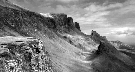
The Quirang
|
|||||||||||
|
|
|||||||||||
|
Grant Campbell |
Feel free to deconstruct my efforts and give your opinion on artistic or technical points.
|
||||||||||
|
|
|||||||||||
|
Terry R. Hatfield |
Hi Grant Im Not Much For B&W Images Either,This One Has Nice Comp And Tonal Range And That Dramitic Sky Looks Great!The Other Image Lacks Impact This Ones Holds Your Attention Much Better,Great Job:-)
|
||||||||||
|
|
|||||||||||
|
Pam M |
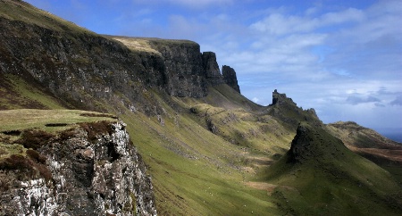
Okay Grant ... If I tell you why I suspect this one works and the other one doesn't, can we see the color one? ;) It seems that those of us who read from left to right read photographs in the same way. This image makes strong statements on the left intro to the photo ... the other doesn't. In this image, the topology is very clearly understood throughout the whole image. The other one looks like cloud shadows made their own imprints and it's difficult to separate depth from shadow. This image ends on the right with a very clear understanding of depth and subject. The other one is muddled (again I think it's clouds). Also, in the other image, the so so entry on the left combined with the muddled exit on the right combines to effectively put the subject totally within the "frame" of the pic. The brain is therefore satisfied that that's all there is and is not intrigued to wonder anything more about the image ... thus the loss of attention. ok so ... now ... stop teasing this flatlander and let me see the color ... please :-D have fun,
|
||||||||||
|
|
|||||||||||
|
Rosemary Buffoni |
Very interesting discussion going on. I like this one the best-it has good compositional flow thru the image caused by the diagonal flow from strong forground thru the curved center into the lighter (than the other) sky. I feel as if this image goes on forever-whereas the other ends abruptly for me. The tones are also great in this one. Ro
|
||||||||||
|
|
|||||||||||
|
Grant Campbell |
I really didn't want to submit the original, because it just doesn't do the location any justice and at the time of capture I was concentrating on form, composition, texture and light play (blah blah). So you could say I was thinking in mono, and I'm sure you'll agree that the colour version doesn't come close to the mono version in terms of atmosphere or wonderment at how this landscape was formed. In short it (the mono image) actually draws the viewer to examine the scene more closely. I think it's got something to do with the brain having to 'fill the gaps' that makes mono such an itriguing medium. On the subject of comparing the two versions in mono, I was torn between these two but I do agree that this one works best. Foregound interest, rules of thirds and sevenths are at play here as well as leading the eye from left to right. However the other version does have some redeeming points, the leading line of the foreground cliff edge forces the viewer (well me, and other weirdo 'right brainers'anyway) to read the image in a circular manner, starting from bottom right and going clockwise, what lets it down though is the lack of human interest eg. I wish I'd put the camera on a self timer and stood at the edge of the abyss! Now that would have made it more compelling. Apologies for the delay in my response, by the way, my college year just wrapped up, so I've been rather busy printing, mounting and helping set up the annual show.
|
||||||||||
|
|
|||||||||||
| Log in or sign up to respond or interact. | |||||||||||